
Interior Colour Trends: How to Choose Colours That Make Art Stand Out


Interior colour trends 2026 are moving in an interesting direction.
The cold whites, hard contrasts and perfectly coordinated rooms that have dominated interiors for years are giving way to something warmer, softer and more personal.
Think milky ivory, warm oat, cream, taupe, clay, muted olive, washed blue and deeper earthy tones. Think layered colour rather than one dramatic accent wall. Think natural materials, softer contrasts and rooms that feel lived in rather than staged.
But there is another question worth asking when choosing a colour for your home:
What will that colour do to the art on your walls?

A wall is not simply a background for a painting. It changes the way colour, light, scale and atmosphere are experienced.
The right wall colour can make a painting feel luminous. It can draw out a subtle colour that you had barely noticed. It can give a large artwork breathing room.
The wrong colour can compete with the painting, flatten its impact or make an otherwise beautiful work feel disconnected from the room.
That is why the most useful way to look at the 2026 colour trends is not simply to ask, “What colours are fashionable?”
Instead, ask:
“Which colours will create the right environment for the artwork I want to live with?”
The 2026 colour story is about atmosphere
South African design is already reflecting this shift.
Decorex Africa’s 2026 theme, The Soft Life, places comfort, restoration and intentional living at the centre of contemporary interiors. Its colour direction includes milky ivories, warm oat tones, taupes, creams, clay, muted olive and washed blues. The emphasis is less on a single fashionable colour and more on creating an atmosphere through colour, texture and layering.
Plascon’s 2026 Colour Forecast takes a similarly human approach. Its overarching theme, HAND, made, responds to a renewed appreciation for individuality, craft and the imperfect qualities of things made by hand. Its four colour worlds combine neutrals and expressive colours, with the Land + Sea palette particularly relevant to interiors inspired by nature: African Mud, Olive, Bashful Blue and other earthy and water-inspired tones.
This is significant for art.
Paintings are made by hand. They contain texture, gesture, variation and personality. They don’t have to be perfectly matched to their surroundings.
In fact, they often look better when the room gives them enough space to be themselves.
1. Interior Colour Trends 2026: Warm Neutrals and Earthy Tones are replacing stark white
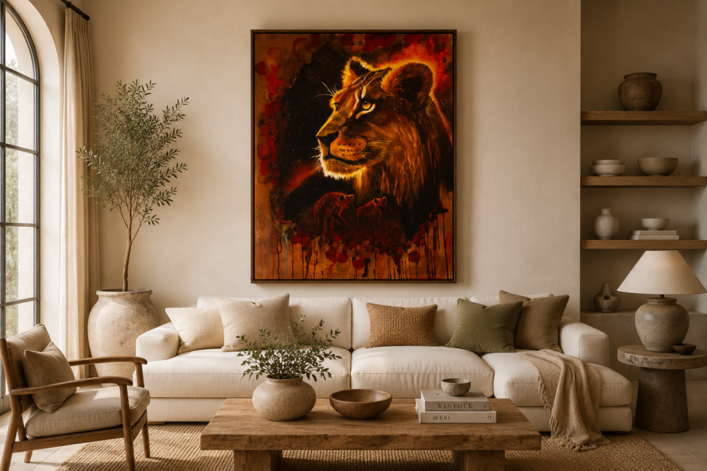
One of the strongest interior colour directions for 2026 is the move towards warmer neutrals.
Milky ivory.
Cream.
Warm oat.
Soft taupe.
Warm greige.
These colours are versatile because they don’t demand attention from the rest of the room.
They create a quieter visual field around furniture, natural timber, stone, textiles — and artwork.
Why warm neutrals work so well with art
A painting already contains its own colour story.
It may contain several colours that interact with one another through contrast, temperature, saturation and tone. Adding a highly saturated wall colour can introduce another competing colour relationship.
A warm neutral is different.
It can act as breathing room.
This is particularly effective with large statement paintings because the wall allows the artwork to become the strongest visual event in the room.
Imagine a large wildlife painting above a low cream sofa, surrounded by warm ivory walls and natural timber.
The room does not need to compete with the painting.
The painting becomes the colour statement.
That is one of the reasons the warm-neutral direction is particularly relevant to collectors who want artwork to remain the focal point of a contemporary interior.
Try this
If your painting contains several strong colours, start by looking at its least dominant colours.
A warm ivory, stone or soft taupe wall may allow those quieter colours to emerge without competing with the dominant areas of the painting.
The goal isn’t necessarily to match the wall to the artwork.
The goal is to support the relationships already inside the artwork.
2. Earth tones are becoming richer

The return to earthy interiors does not mean turning your home brown.
The 2026 interpretation is more sophisticated.
Think:
- clay
- terracotta
- ochre
- muted olive
- sandstone
- cognac
- warm walnut
- earthy red
- mineral-inspired browns
Decorex’s 2026 palette reflects this move towards refined earth tones, while Plascon’s Land + Sea colour world draws directly from natural landscapes, including earth, moss, water and clay-like tones.
These colours are particularly interesting when used around artwork inspired by nature.
Wildlife paintings, African landscapes and expressive abstracts often already contain variations of earth, stone, vegetation and sky.
Rather than matching the wall exactly to one colour in the painting, use the surrounding palette to create a visual conversation.
For example, a painting containing ochre, brown, black and muted green could sit beautifully against a soft olive, warm stone or earthy neutral.
The painting does not disappear into the room.
Instead, the room gives the painting somewhere to belong.
3. Blue is taking a different direction in 2026

Blue has not disappeared from interiors.
It has simply become more nuanced.
Decorex Africa’s 2026 colour direction includes washed and softened blues, while Dulux South Africa has made blue the focus of its 2026 Colour of the Year family, with three indigo-related shades ranging from airy Mellow Flow to the deeper, meditative Slow Swing.
Pinterest has taken blue in another direction with Cool Blue, a very pale, icy blue included in its 2026 Pinterest Palette. Pinterest describes the Palette as a forecast based on its insights into emerging colour interest.
For an art-filled room, the interesting point is that blue does not have to become the dominant colour.
A small amount can be enough.
Blue can appear in:
- cushions
- ceramics
- a rug
- a chair
- books
- decorative objects
- curtains
- or a single painted wall
If the artwork already contains blue, repeating that colour elsewhere in the room can create cohesion.
But there is an important distinction between echoing a colour and matching it.
You don’t need the exact blue from the painting.
A softer or darker version can create a much more sophisticated relationship.
A useful rule
If blue appears in the artwork as a secondary colour, consider using it as a secondary colour in the room too.
That creates connection without turning the entire interior into a themed colour scheme.
4. Dark walls can make artwork glow

For years, dark walls were often treated as a dramatic design choice.
In 2026, deeper interiors are becoming more sophisticated and layered.
Think charcoal, deep brown, dark green, wine, burgundy and plum.
Pinterest’s 2026 trend research includes Neo Deco, a modern interpretation of Art Deco that combines richer colours with brass, leather, sculptural forms and glamorous details. Searches associated with the trend include brass aesthetics, antique bar carts, leather banquettes and other richly layered interiors.
This creates a completely different environment for art.
A pale painting against a white wall can feel airy and contemporary.
The same painting against a deep charcoal wall can suddenly feel luminous.
Dark walls can also be particularly effective with:
- gold
- ochre
- cream
- warm white
- rust
- copper
- cognac
- deep red
The key is contrast.
A dark wall does not automatically make a room heavy. When balanced with lighter furniture, controlled lighting and reflective or natural materials, it can create an intimate setting in which the artwork becomes the source of light and colour.
This is where a large statement painting can become exceptionally powerful.
The room recedes.
The artwork comes forward.
5. Pinterest’s 2026 colours offer another layer of inspiration
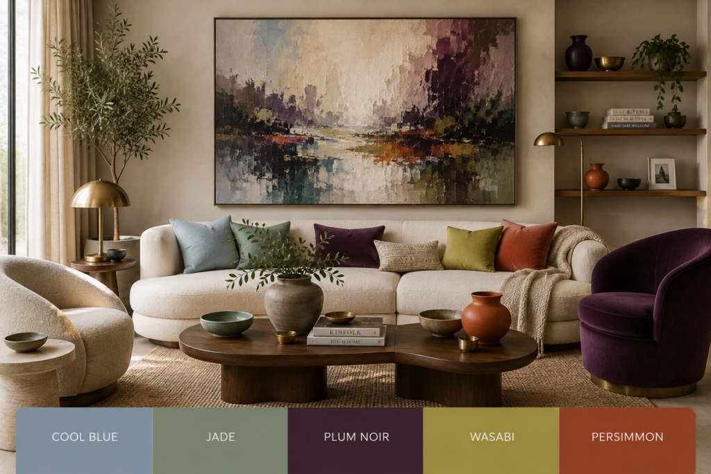
Pinterest’s official 2026 Palette contains five colours:
Cool Blue
Jade
Plum Noir
Wasabi
Persimmon
The palette ranges from icy blue and muted green through deep plum and energetic yellow-green to a strong orange-red.
You don’t need to paint an entire room in one of these colours.
In fact, that would miss the more interesting lesson.
Use trend colours as inspiration, not instructions.
For example:
Cool Blue can inspire a pale blue accent around a coastal or contemporary artwork.
Jade can connect beautifully with botanical, landscape or African-inspired interiors.
Plum Noir can introduce depth around artwork containing wine, burgundy, brown or deep red.
Persimmon can pick up rust, orange and terracotta already present in an expressive painting.
Wasabi is much more energetic and is best treated as an accent rather than a dominant backdrop when the artwork itself is already strong.
The important question is always:
Does this colour support the painting, or is it competing with it?
6. Don’t choose the wall colour before considering the artwork

This is perhaps the biggest mistake people make when decorating around original art.
They choose the wall colour first.
Then they try to find artwork that works with it.
That can work.
But if you already own a painting you love — or you are choosing a statement artwork for a room — reverse the process.
Start with the artwork.
Look closely at it.
What is the dominant colour?
What are the secondary colours?
Is the overall temperature warm or cool?
Is the contrast high or low?
Does the painting feel dramatic, calm, earthy, luminous or energetic?
Then look at the room.
What does the natural light do throughout the day?
Are the floors warm timber or cool stone?
Are the furnishings cream, grey, brown or coloured?
Are there brass, black or bronze details?
Only then start looking at wall colours.
This creates a much more integrated result.
7. Think in terms of colour relationships, not colour matching
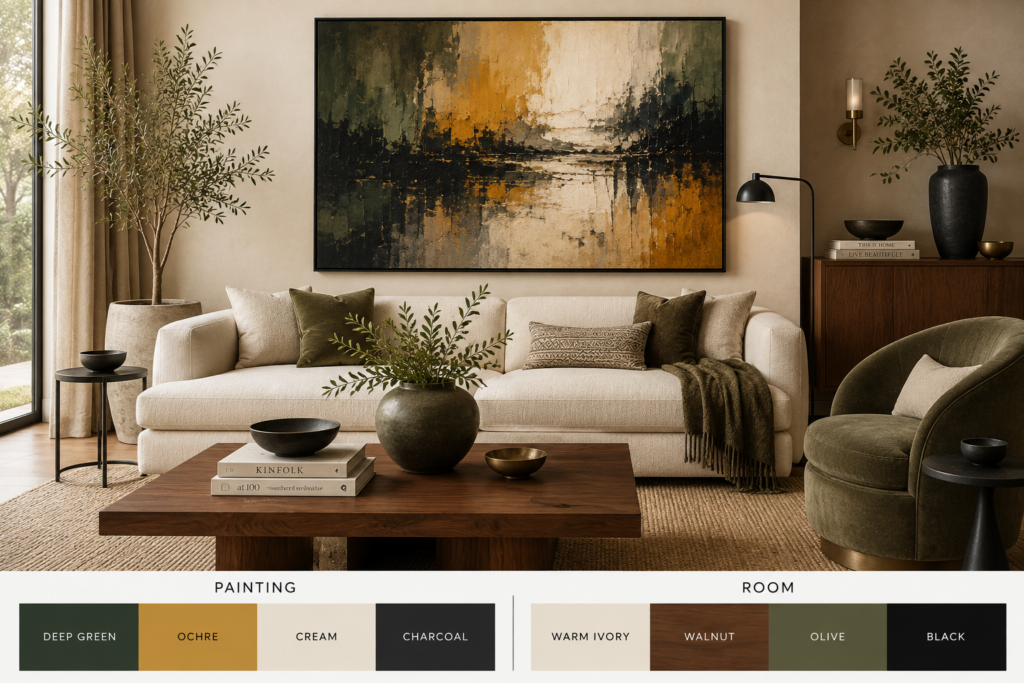
A sophisticated interior rarely depends on everything being the same colour.
Instead, colours relate to one another.
A painting might contain:
deep green + ochre + cream + charcoal
The room could then use:
warm ivory + walnut + olive + black
There is no exact colour match.
But there is a relationship.
This is particularly important with original art because a painting can contain many subtle variations that are difficult to reproduce elsewhere in a room.
Trying to match one of those colours exactly can actually make the room feel artificial.
Instead, repeat the temperature, depth or mood of the artwork.
A warm painting can work with warm materials.
A cool painting can work with cooler neutrals.
A dramatic painting can benefit from controlled contrast.
A quiet painting may need a quieter environment.
8. Your artwork doesn’t have to match your interior

This deserves saying clearly.
Art does not have to match the sofa.
A painting is not a cushion.
It doesn’t exist simply to complete a colour scheme.
Original art can introduce something unexpected into a room.
It can provide contrast.
It can challenge the palette.
It can introduce a colour that wasn’t there before.
It can even become the element that changes how the rest of the room is perceived.
This is one reason the move towards more personal interiors is so interesting.
Pinterest’s 2026 trend research includes Afrohemian Decor, reflecting growing interest in interiors that combine African and bohemian influences, natural materials and distinctive decorative elements. It also includes Wilderkind, an animal-inspired aesthetic.
For collectors of African wildlife and landscape art, this creates an especially interesting visual environment.
The artwork doesn’t need to be treated as a souvenir or thematic accessory.
It can be the sophisticated focal point around which the room is built.
9. Three ways to use the 2026 colour direction with artwork

There isn’t one correct approach.
Warm Ivory + Natural Wood
The artwork becomes the colour statement.
This approach works particularly well with contemporary warm minimalism, neutral homes and large statement paintings.
The restrained palette gives the artwork breathing room. It is the safest option when you want the painting to dominate visually without making the room feel stark.he best choice depends on the artwork and the atmosphere you want to create.
Charcoal + Cognac
The artwork becomes luminous.
A darker wall, cognac leather, warm timber and controlled metallic accents create a richer environment.
This works particularly well for dramatic paintings, sophisticated lounges, studies, libraries and collector-style interiors. The contrast between the dark surroundings and the artwork can give the painting considerably more visual authority.
Stone + Blue
The artwork becomes part of a controlled colour conversation.
A stone or warm neutral base combined with carefully placed blue accents can work beautifully in contemporary interiors.
This is particularly effective when the artwork already contains blue.
The blue does not need to dominate.
It simply needs to appear often enough for the eye to recognise the connection.
10. The most important trend may be personal colour

The biggest lesson from the 2026 colour conversation isn’t actually a particular paint colour.
It is the movement towards interiors that feel more human.
Decorex describes 2026 through the idea of The Soft Life — spaces designed around comfort, intention and emotional experience. Plascon similarly describes a movement away from perfection and polish towards homes that feel real, layered and emotionally resonant.
That changes the question we should ask about our homes.
Instead of:
“What colour is trending?”
perhaps ask:
“What do I want this room to feel like?”
And when artwork is involved, add another question:
“What environment allows this painting to be experienced at its best?”
That is a much more useful way to approach colour.
How to choose a wall colour for your artwork

Before committing to a paint colour, look at these five things:
1. The dominant colour in the artwork
Don’t automatically match it. Decide whether you want to echo it or contrast with it.
2. The secondary colours
These can often provide better inspiration for the room than the dominant colour.
3. The temperature
Warm artwork generally sits comfortably with warm neutrals and natural materials, while cooler artwork may benefit from stone, grey or blue-based surroundings.
4. The amount of contrast
High-contrast artwork often needs more breathing room.
A quieter painting may tolerate — or even benefit from — stronger surrounding colour.
5. The natural light
The same wall colour can look completely different in morning light, afternoon light and artificial evening light.
Always consider the actual room rather than relying only on a paint swatch.
The wall is part of the artwork’s environment

Choosing a wall colour is not simply a decorating decision.
It is part of deciding how a painting will be experienced.
A warm ivory wall can make a bold painting feel even more powerful.
A deep charcoal wall can make light colours glow.
A muted olive can connect artwork to natural materials and landscapes.
A washed blue can create calm around a coastal or contemporary work.
And a carefully chosen neutral can simply step aside and let the painting speak.
That is why the best interior colour for artwork is not necessarily the most fashionable colour.
It is the colour that allows the artwork to belong in the room without losing its identity.
Let the artwork lead
The 2026 interior colour trends are giving us plenty of beautiful directions to explore: warm neutrals, clay and earthy tones, softened greens and blues, deeper dramatic shades and richer, more personal colour combinations.
But trends are only the starting point.
Your artwork is the part that makes the room yours.
At IdaArt, paintings are created to live beyond the studio — in homes, contemporary interiors and spaces where colour, light and atmosphere become part of the experience of the work.
See how artwork can transform a room → Explore the IdaArt collection
And if you already have a room in mind, don’t begin with the paint chart.
Begin with the painting.